Appearance
Overview
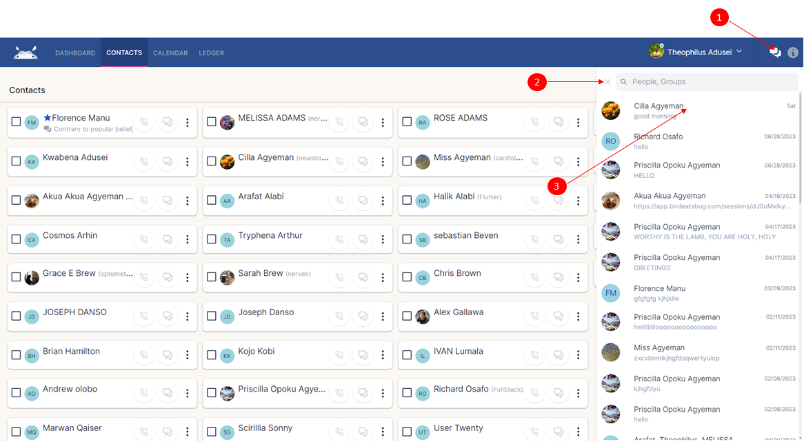
The provided image depicts the layout view of the chat panel, showcasing its various functionalities. Here's a brief overview of some actions highlighted in the image:
- Button 1: Clicking this button will activate and display the chat panel or ChatList component, allowing you to interact with other users.
- Button 2: When clicked, this button closes the chat panel, providing a seamless user experience.
- Button 3: By clicking this button or any contact listed in the chat panel, you can instantly access your chat history with that specific contact with the Message List component. This feature simplifies communication and helps you keep track of your conversations effortlessly.
With these intuitive and efficient functionalities, our chat panel enhances your communication experience and ensures easy access to your chat history with just a few clicks.
Message List component
The message list is thoughtfully organized into three distinct segments, each serving a specific purpose: the user details, the chats area, and the input controls.
The user details
In this section, you'll find essential and relevant information about the selected contact or group. This includes details such as the contact's name, profile picture, or any other relevant data that helps you identify and connect with them more effectively. The user details area provides a quick overview, ensuring you have the necessary context before engaging in any conversation.
How to extend user's details
Below is a code snippet demonstrating how to include additional user details, specifically the "faxNumber" to the user details list.
svelte
  <script lang="ts">
    import { slide } from "svelte/transition"
    import { Icon } from "@steeze-ui/svelte-icon"
    import { ArrowLeft } from "@steeze-ui/heroicons"
    import { ArrowUpS, ArrowDownS, MapPin, Phone, Mail, ShieldUser, Phone2 } from "@steeze-ui/remix-icons"

    export let contact
    let showDetails = false
  </script>
    {#if showDetails}
      <div transition:slide={{duration:150}}>
        {#if contact.address}
          <div class="flex gap-4 mx-5">
            <Icon src={MapPin} size=24 class="text-gray-400"/>
            <div class="flex flex-col flex-grow">
              <span class="text-gray-400 text-sm">{contact.address}</span>
            </div>
          </div>
        {/if}
        {#if contact.phoneNumber}
          <div class="flex gap-4 mx-5 mt-4">
            <Icon src={Phone} size=24 class="text-gray-400"/>
            <span class="font-medium text-base">{contact.phoneNumber}</span>
          </div>
        {/if}
        {#if contact.email}
          <div class="flex gap-4 mx-5 my-4">
            <Icon src={Mail} size=24 class="text-gray-400"/>
            <span class="font-medium text-base">{contact.email}</span>
          </div>
        {/if}
        <!-- faxNumber start -->
        {#if contact.email}
          <div class="flex gap-4 mx-5 my-4">
            <Icon src={Phone2} size=24 class="text-gray-400"/>
            <span class="font-medium text-base">{contact.faxNumber}</span>
          </div>
        {/if}
        <!-- faxNumber end -->
      </div>
    {/if}
The chats area
This section is rendered in the ChatEntry component and showcases a comprehensive view of all end-to-end chats along with their respective timestamps.
Discover a seamless experience as you explore your entire chat history, spanning from the beginning of conversations to the most recent interactions. Each chat is accompanied by its corresponding timestamp, allowing you to track the flow of conversations and conveniently revisit past discussions.
The input controls
The ChatInput component is responsible for rendering this section, providing a user-friendly interface for composing messages and accessing various controls.
Within the ChatInput component, you'll find an input box or tag designed to effortlessly compose and send messages. Additionally, there are convenient controls available, such as an emoji selector button, file attachment button, and send button, offering users versatile ways to communicate and interact effectively.
How to extend
Below is a code snippet example on how extend the input controls. Here we will introduce a new control to permit voice recording.
svelte
  <script lang="ts">
    import { Icon } from "@steeze-ui/svelte-icon";
    import { SendPlane2, Attachment, File3, Image } from "@steeze-ui/remix-icons"
    import { DotsHorizontal, Microphone, PaperClip } from "@steeze-ui/heroicons"
    import EmojiSelector from 'svelte-emoji-selector'
    import { createEventDispatcher } from "svelte"

    let dispatch = createEventDispatcher()
    let open = false
    let message = {
      content: "",
      contentType: "text"
    }

    function onEmoji(event) {
      message.content += event.detail;
    }

    function sendMessage(){
      if (message.content.length > 0){
        dispatch("message", message)
        message = { content: "", contentType: "text" }
        return
      }
    }

  </script>

  <div class="flex justify-between mx-4  ">
    <div class="flex gap-3">
      <!-- Emoji selector control -->
      <button class="  text-base relative btnText">
        <EmojiSelector on:emoji={onEmoji}/>
      </button>

      <!-- File attachment control -->
      <button on:click={() => open = !open} class="btnText"><Icon src={PaperClip} size=19 /></button>

      <!-- Voice recording control -->
      <button class="btnText"><Icon src={Microphone} size=19/></button>
    </div>

    <!-- Send button -->
    <button on:click={sendMessage} class="btnText">
      <Icon src={SendPlane2} size=19/>
    </button>
  </div>